
by twistedpixels | Jun 8, 2026 | Graphic Design
Name the audience and the action they should take. Before artwork is approved, identify where it will be seen and who needs to use the files. A design that works at full screen may behave differently on a printed item or small mobile crop.
Make the decision
Attach current artwork and separate mandatory information from preferences.
Check the result
Agree who approves the work and what the final files must include. Try the checks on one real item, such as a business card, social graphic or packaging panel. Keep the approved file and its production instructions together.
Test it on a practical example
As a working exercise, choose one live example you can check from start to finish. Write down the intended result before comparing versions, or it will be difficult to tell whether a later change improved anything.
- Attach current artwork and separate mandatory information from preferences.
- Agree who approves the work and what the final files must include.
- Compare the final result with the intended use, and record who will confirm that it is ready.
Use the most demanding finished format for the first comparison. An identity that reads clearly on a widescreen presentation can look very different as a small mark on a printed label. Keep the content constant across the options and compare the reading order, the amount of usable space and the appearance of the approved artwork in each size.
What to record before sign-off
Keep a written record of the approved design direction, the exact file used for proofing and the intended production method. If changes are made after sign-off, check the affected formats again before releasing the new artwork.
For help with this work, explore our graphic design in East Kilbride and Glasgow or tell us about your project.
Related reading

by twistedpixels | Apr 15, 2026 | Graphic Design
Group products around customer decisions such as use, size or compatibility. Before artwork is approved, identify where it will be seen and who needs to use the files. A design that works at full screen may behave differently on a printed item or small mobile crop.
Working through the details
Use a repeatable grid for images, specifications and product references.
A check you can repeat
Test one spread with the most complicated product before rolling out the design. Try the checks on one real item, such as a business card, social graphic or packaging panel. Keep the approved file and its production instructions together.
Test it on a practical example
As a working exercise, choose one live example you can check from start to finish. Write down the intended result before comparing versions, or it will be difficult to tell whether a later change improved anything.
- Use a repeatable grid for images, specifications and product references.
- Test one spread with the most complicated product before rolling out the design.
- Compare the final result with the intended use, and record who will confirm that it is ready.
Use the most demanding finished format for the first comparison. An identity that reads clearly on a widescreen presentation can look very different as a small mark on a printed label. Keep the content constant across the options and compare the reading order, the amount of usable space and the appearance of the approved artwork in each size.
What to record before sign-off
Keep a written record of the approved design direction, the exact file used for proofing and the intended production method. If changes are made after sign-off, check the affected formats again before releasing the new artwork.
For help with this work, explore our brochure design in East Kilbride and Glasgow or tell us about your project.
Related reading

by twistedpixels | Apr 1, 2026 | Graphic Design
For shop owners and retail managers, the commercial value of visual identity design is a consistent identity across the places customers encounter the business. Customers often see the offer from the pavement, a search result or a social post before visiting.
Consider a seasonal change that needs to reach both regular and passing customers. In that situation, the value of professional support is a clearer agreement about what gets delivered, who approves it and what it will do for customers.
Choosing a suitable scope
The comparison here is a focused update to the existing identity versus a broader identity system. Neither option has value in isolation. The right scope depends on whether the immediate priority is a clear route from the first message to a visit, enquiry or purchase, and whether store staff who need to answer questions at busy times can maintain what has been agreed. A smaller commission can work well where there is one clear deadline and a stable offer. Where several teams or formats are involved, a broader scope may prevent duplicated effort, conflicting information or production delays.
For a physical job, the production and delivery schedule may matter as much as the design time. An installation or print run can depend on details that a visual presentation does not reveal. Ask which decisions affect production and when the opportunity to make changes closes.
What affects the quote
The most relevant quote factors are current brand files, rollout priorities and the number of customer-facing formats. Recognition and consistency matter more than a long list of unused files. Ask the provider to identify the assumptions behind the price, the work included and which changes would require another estimate. Two quotes can differ because one includes approval, production, delivery or ongoing support that the other treats as separate work. A fair comparison puts both proposals against the same business outcome and the same final deliverables.
What you can expect to receive
A useful proposal should specify logo variations, typography and colour guidance with approved digital and print assets. For independent retailers, the conversation will usually be clearer when the business can share current opening information and details of any imminent promotion. That information helps the supplier assess the scope and highlight anything the team still needs to decide. It also gives the people responsible for approval something concrete to review before the work moves into production or launch.
How to judge the completed work
Agree what a usable result looks like for shop owners and retail managers. A plausible success test is whether the work supports a clear route from the first message to a visit, enquiry or purchase, under the conditions the business sees day to day. Ask what the supplier will present for approval and who will own any issue spotted at that point. For a fixed deadline, check what date the supplier needs final approval, and what options are available if an essential detail changes.
Discussing your project with Twisted Pixels
Twisted Pixels can discuss the brief with shop owners and retail managers in East Kilbride, Glasgow and the surrounding area. Tell us what the work needs to achieve, who it is for and when it needs to be ready. We can explain what a suitable scope is likely to include and where a sample, existing asset or more precise specification would make a quote more useful.
Explore visual identity design, browse Twisted Pixels Insights or discuss your brief with Twisted Pixels.
Related commissioning guides

by twistedpixels | Mar 19, 2026 | Graphic Design
Test the mark at business-card and app-icon sizes. Before artwork is approved, identify where it will be seen and who needs to use the files. A design that works at full screen may behave differently on a printed item or small mobile crop.
Apply it to a real example
Compare the full logo with a simplified symbol or wordmark.
Review before approval
Check recognition in one colour before approving fine detail. Try the checks on one real item, such as a business card, social graphic or packaging panel. Keep the approved file and its production instructions together.
Test it on a practical example
As a working exercise, choose one live example you can check from start to finish. Write down the intended result before comparing versions, or it will be difficult to tell whether a later change improved anything.
- Compare the full logo with a simplified symbol or wordmark.
- Check recognition in one colour before approving fine detail.
- Compare the final result with the intended use, and record who will confirm that it is ready.
Use the most demanding finished format for the first comparison. An identity that reads clearly on a widescreen presentation can look very different as a small mark on a printed label. Keep the content constant across the options and compare the reading order, the amount of usable space and the appearance of the approved artwork in each size.
What to record before sign-off
Keep a written record of the approved design direction, the exact file used for proofing and the intended production method. If changes are made after sign-off, check the affected formats again before releasing the new artwork.
For help with this work, explore our logo design in East Kilbride and Glasgow or tell us about your project.
Related reading

by twistedpixels | Feb 8, 2026 | Graphic Design
List what has changed in your audience, offer or market position. Before artwork is approved, identify where it will be seen and who needs to use the files. A design that works at full screen may behave differently on a printed item or small mobile crop.
Apply it to a real example
Find where inconsistent branding creates confusion in enquiries or sales materials.
Review before approval
Prioritise the assets that customers encounter most often. Try the checks on one real item, such as a business card, social graphic or packaging panel. Keep the approved file and its production instructions together.
Test it on a practical example
As a working exercise, choose one live example you can check from start to finish. Write down the intended result before comparing versions, or it will be difficult to tell whether a later change improved anything.
- Find where inconsistent branding creates confusion in enquiries or sales materials.
- Prioritise the assets that customers encounter most often.
- Compare the final result with the intended use, and record who will confirm that it is ready.
Use the most demanding finished format for the first comparison. An identity that reads clearly on a widescreen presentation can look very different as a small mark on a printed label. Keep the content constant across the options and compare the reading order, the amount of usable space and the appearance of the approved artwork in each size.
What to record before sign-off
Keep a written record of the approved design direction, the exact file used for proofing and the intended production method. If changes are made after sign-off, check the affected formats again before releasing the new artwork.
For help with this work, explore our branding and identity in East Kilbride and Glasgow or tell us about your project.
Related reading
by twistedpixels | Feb 3, 2026 | Graphic Design
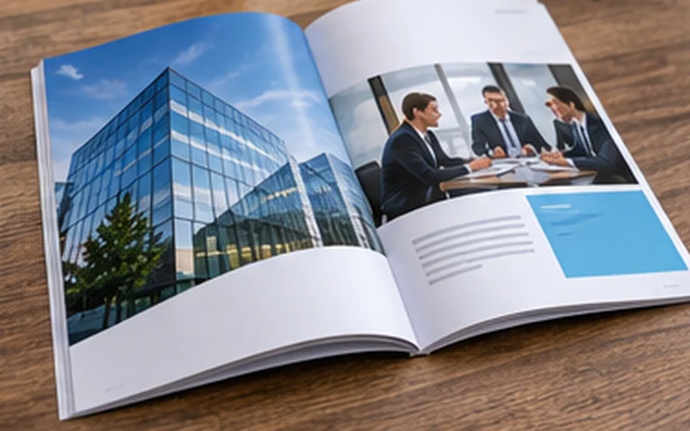
When business owners and practice managers compare suppliers for brochure design, the useful question is whether the project will deliver a clear sales document that helps readers compare what the business offers. Potential clients often compare credibility, scope and suitability before they make contact.
Consider an offer with several service levels that needs to make the scope understandable. In that situation, the value of professional support is a clearer agreement about what gets delivered, who approves it and what it will do for customers.
Choosing a suitable scope
The comparison here is a short overview versus a detailed publication designed for reference. Neither option has value in isolation. The right scope depends on whether the immediate priority is better qualified enquiries and fewer conversations caused by an unclear description of the work, and whether the people who qualify leads and make commercial commitments can maintain what has been agreed. A smaller commission can work well where there is one clear deadline and a stable offer. Where several teams or formats are involved, a broader scope may prevent duplicated effort, conflicting information or production delays.
A small business can often separate a launch requirement from improvements it would like to make later. That distinction lets a supplier explain which items are necessary for a useful result and which could wait. It also makes it easier for the people using the work to understand what will be ready on the agreed date.
What affects the quote
The most relevant quote factors are page count, copy readiness, image availability and the number of revisions. A reader should understand the key services and enquiry route without hunting through the document. Ask the provider to identify the assumptions behind the price, the work included and which changes would require another estimate. Two quotes can differ because one includes approval, production, delivery or ongoing support that the other treats as separate work. A fair comparison puts both proposals against the same business outcome and the same final deliverables.
What you can expect to receive
A useful proposal should specify an agreed layout, proofs for review and artwork matched to the printer's specification. For professional services firms, the conversation will usually be clearer when the business can share an agreed description of the services, permissions for any case examples and a clear enquiry route. That information helps the supplier assess the scope and highlight anything the team still needs to decide. It also gives the people responsible for approval something concrete to review before the work moves into production or launch.
How to judge the completed work
Agree what a usable result looks like for business owners and practice managers. A plausible success test is whether the work supports better qualified enquiries and fewer conversations caused by an unclear description of the work, under the conditions the business sees day to day. Ask what the supplier will present for approval and who will own any issue spotted at that point. For a fixed deadline, check what date the supplier needs final approval, and what options are available if an essential detail changes.
Discussing your project with Twisted Pixels
Twisted Pixels can discuss the brief with business owners and practice managers in East Kilbride, Glasgow and the surrounding area. Tell us what the work needs to achieve, who it is for and when it needs to be ready. We can explain what a suitable scope is likely to include and where a sample, existing asset or more precise specification would make a quote more useful.
Explore brochure design, browse Twisted Pixels Insights or discuss your brief with Twisted Pixels.
Related commissioning guides
